The best brands stand for something: a big idea, a strategic position, a defined set of values, a voice that stands apart. Symbols are vessels for meaning. They become more powerful with frequent use and when people understand what they stand for. They are the fastest form of communication known to man. Meaning is rarely immediate and evolves over time.
Nike

Nike was named after the Greek goddess of victory. Nike’s logo, an abstraction of a wing, designed by Carolyn Davidson in 1971, was meaningful to a company that marketed running shoes. In 1988, Nike’s “Just do it” campaign became a battle cry for an entire generation of athletes. When consumers see the “swoosh” as it is called, they are inspired by the bigger idea to live the slogan.
Apple

Apple customers quickly become brand zealots. When they see the Apple logo, they think innovation and delight. The logo, designed by Rob Janoff in 1976, is an apple with a bite out of it – a friendly symbol of knowledge, and lore has it, a symbol of anarchy from the PC world. The original logo was filled with rainbow stripes, but now it is a simple one-color icon.
Mercedes-Benz

When the Mercedes-Benz logo was originally created by Gottlieb Daimler in 1909, it consisted of a simple depiction of a three-pointed star that represented the company’s “domination of the land, the sea, and the air.” Now this brandmark stands first and foremost for luxury and for the fastest cars on the road. The symbol has been dramatically simplified over the last century and remains highly recognizable.
The O

This symbol was designed for Barrack Obama’s U.S. presidential campaign in 2006. The O, created by Sol Sender and his firm, Sender LLC, symbolized the dawn of a new day. Obama’s messages of hope and change charged the symbol with a deeper level of meaning that resonated with citizens the world over, and became part of the largest social media campaign in history.
Mitsubishi

Mitsubishi stands for quality and reliability and embodies a 130-year-old commitment to earning the trust and confidence of people worldwide. Protecting the trademark designed by Yataro Iwasaki, is a top corporate priority. Each diamond represents a core principle: corporate responsibility to society, integrity and fairness, and international understanding through trade.
CBS

The CBS eye has been the television network’s symbol for over a half century. It has remained unchanged, and has retained its original powerful, all-seeing iconic quality. Originally inspired by the human eye paintings on the side of Shaker barns to ward off evil, it is a highly recognized symbol around the world. Designed by William Golden, it was one of the first symbols designed to function primarily on the screen.
FedEx

The shipping company’s logo is probably one of the best-known in the world of “hidden image” logos. For those who are unaware, take a look between the “E” and the “X,” where the negative space forms an arrow. In an interview with Fast Company, the logo’s designer, Lindon Leader, said, “The arrow could connote forward direction, speed and precision, and if it remained hidden, there might be an element of surprise, that aha moment.” The design has won over 40 awards and was ranked as one of the eight best logos in the last 35 years by Rolling Stone magazine.
Amazon

Your initial thought when looking at the Amazon logo might be that the arrow looks like a smiley face, meaning Amazon is there to make its customers happy. Well, notice that the arrow is pointing from the a to the z; representing the fact that Amazon provides a variety of items for sale, literally from A to Z.
NBC

Yeah, it’s a peacock, but did you ever wonder why it has so many colors? That’s because, during the ’50s, NBC’s owner was RCA and they had just begun to manufacture color televisions. Since RCA wanted people still watching on black-and-white TV to know what they were missing, NBC created a colorful logo to adapt to the new technology.
LG

No, the Pac-Man reference is not confirmed, but it’s cool to look at anyways. There is hidden meaning in the LG logo, though. Everyone knows the face, but its position, as well as the “L” and “G,” inside the circle that matters. According to LG, this centers humanity above all else. The circle itself symbolizes the world, future, youth, humanity, and technology while the red represents friendliness. (Hint: a lot of companies use red for this very reason, as it seems to attract consumers a lot.)
Starbucks

Ah, Starbucks, the inventor of the glorious (or not-so-glorious) Frappuccino. Starbucks was actually named after the chief mate of the Pequod in Moby Dick. The Siren, though, was found in an old marine book, as the creators were creating a nautical theme. Thing is, sirens are associated with death and obsession. Sailors would become obsessed with them that they eventually meet their doom. Ironic? Maybe, but how many people are actually obsessed with Starbucks? A lot of people.
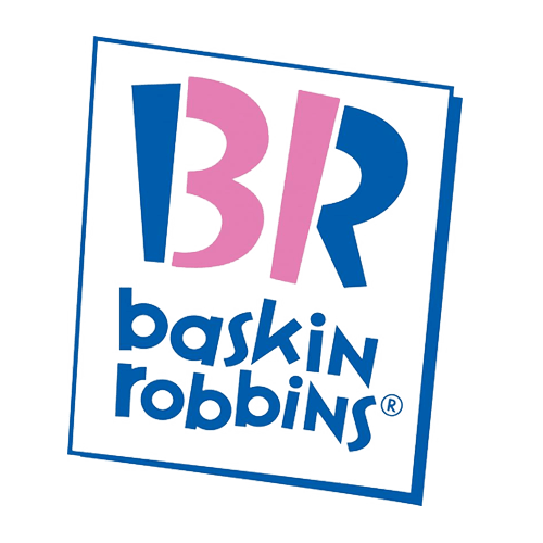
Baskin Robbins

Take a look at what’s highlighted in pink. Look familiar? It’s a 31, which is the number of flavors they offer.
No Comments Yet
Leave a Comment


